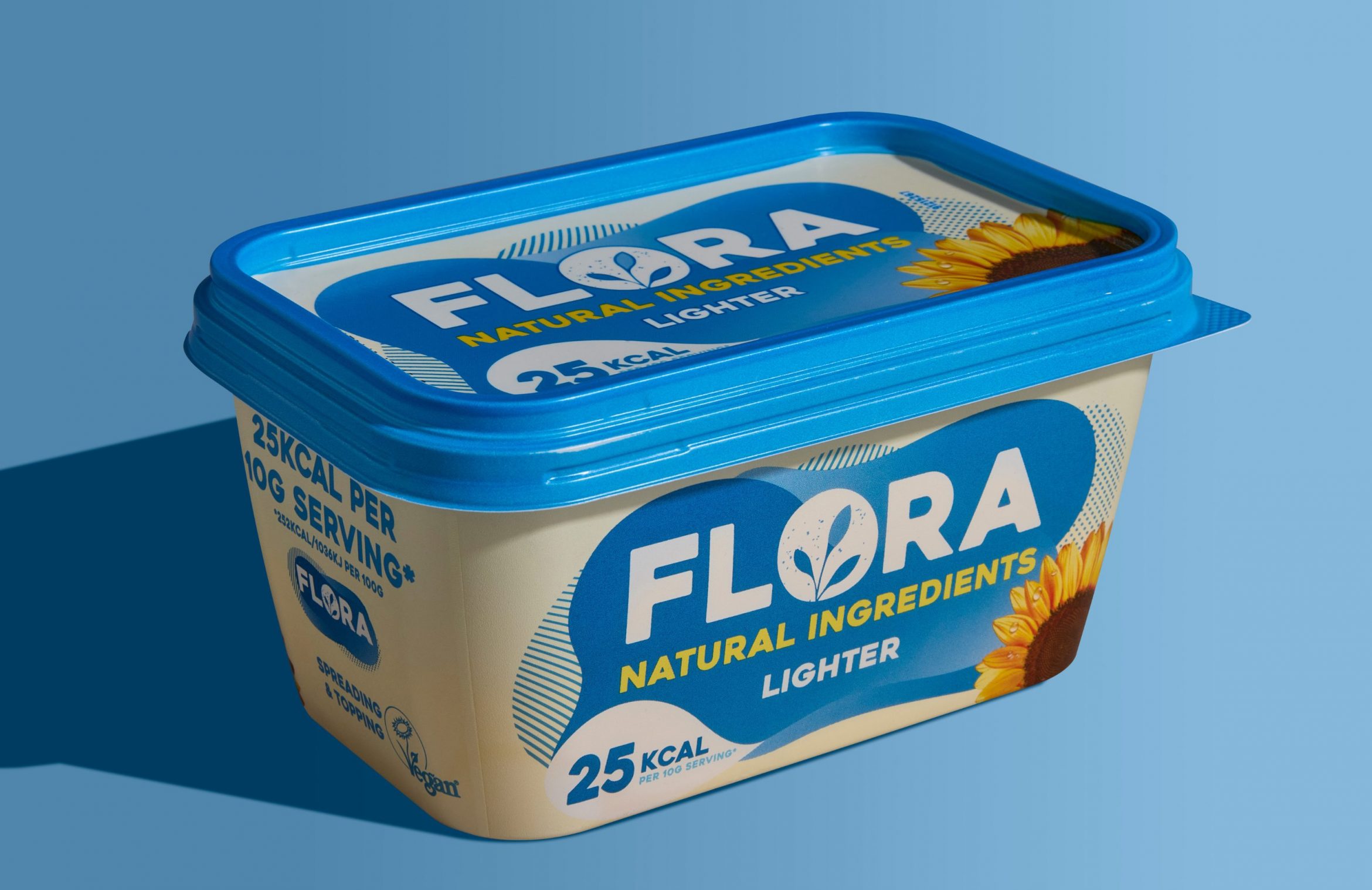
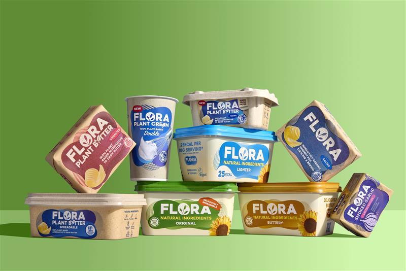
What was the challenge for Flora?
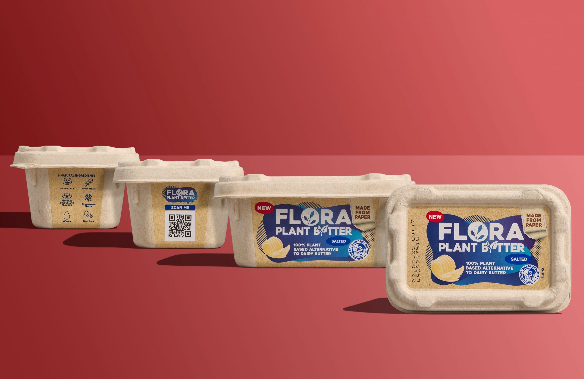
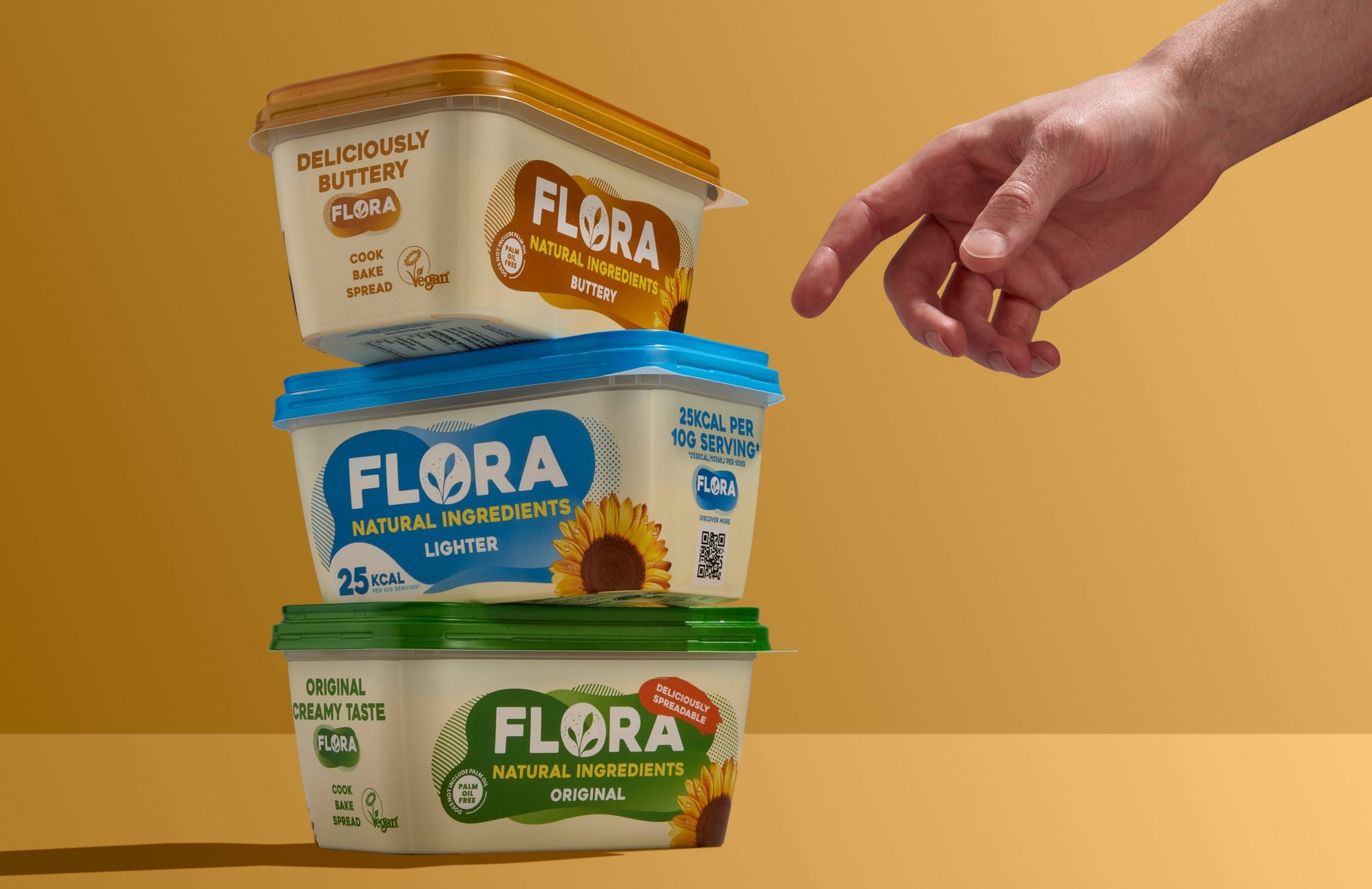
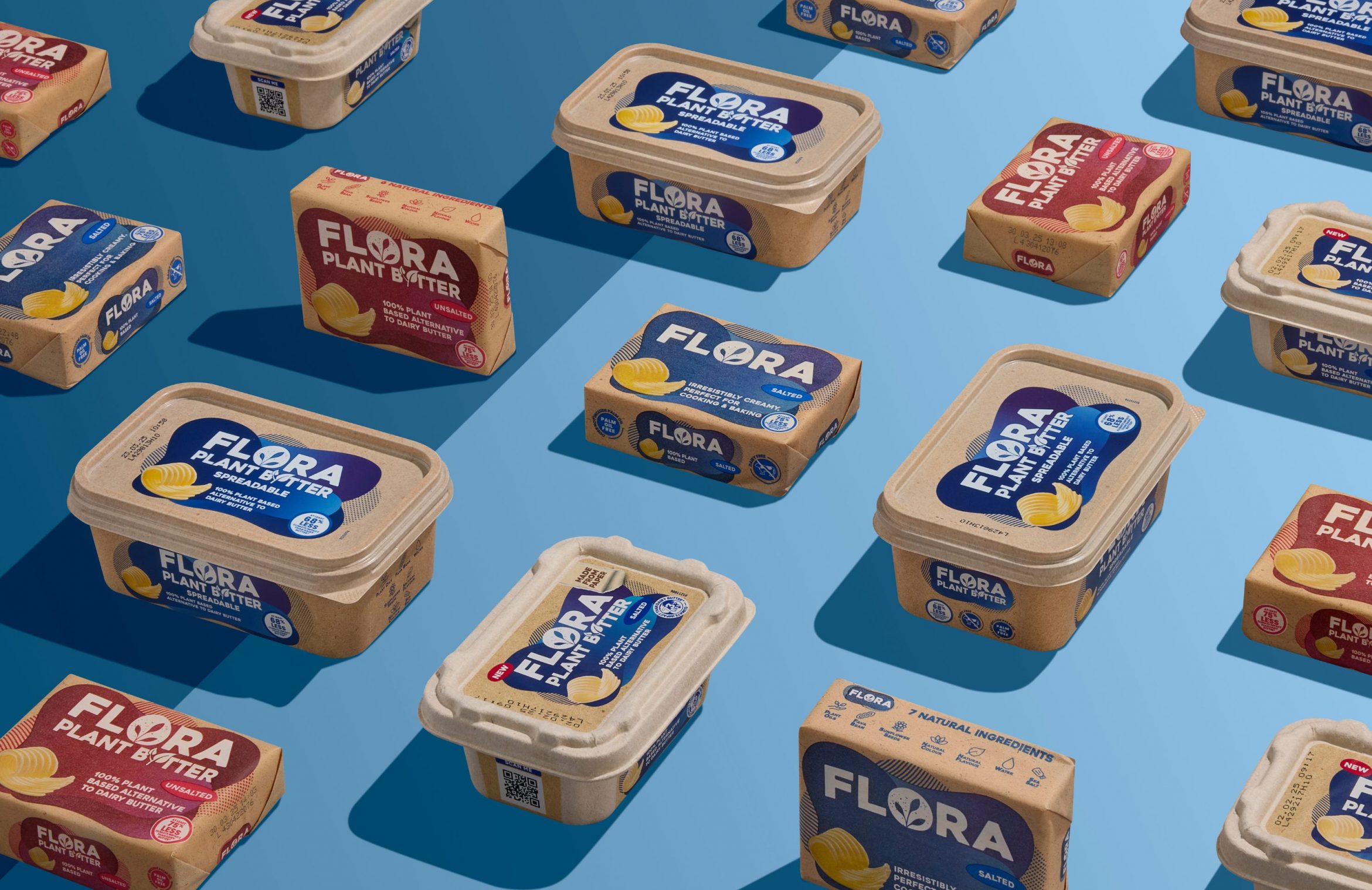
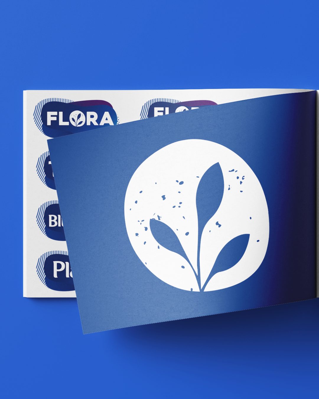
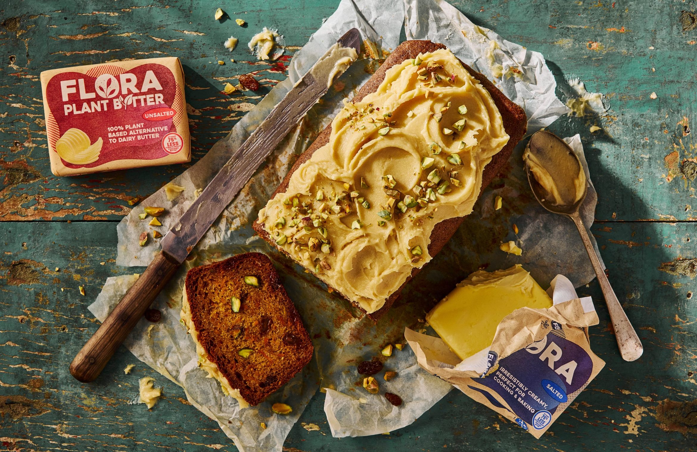
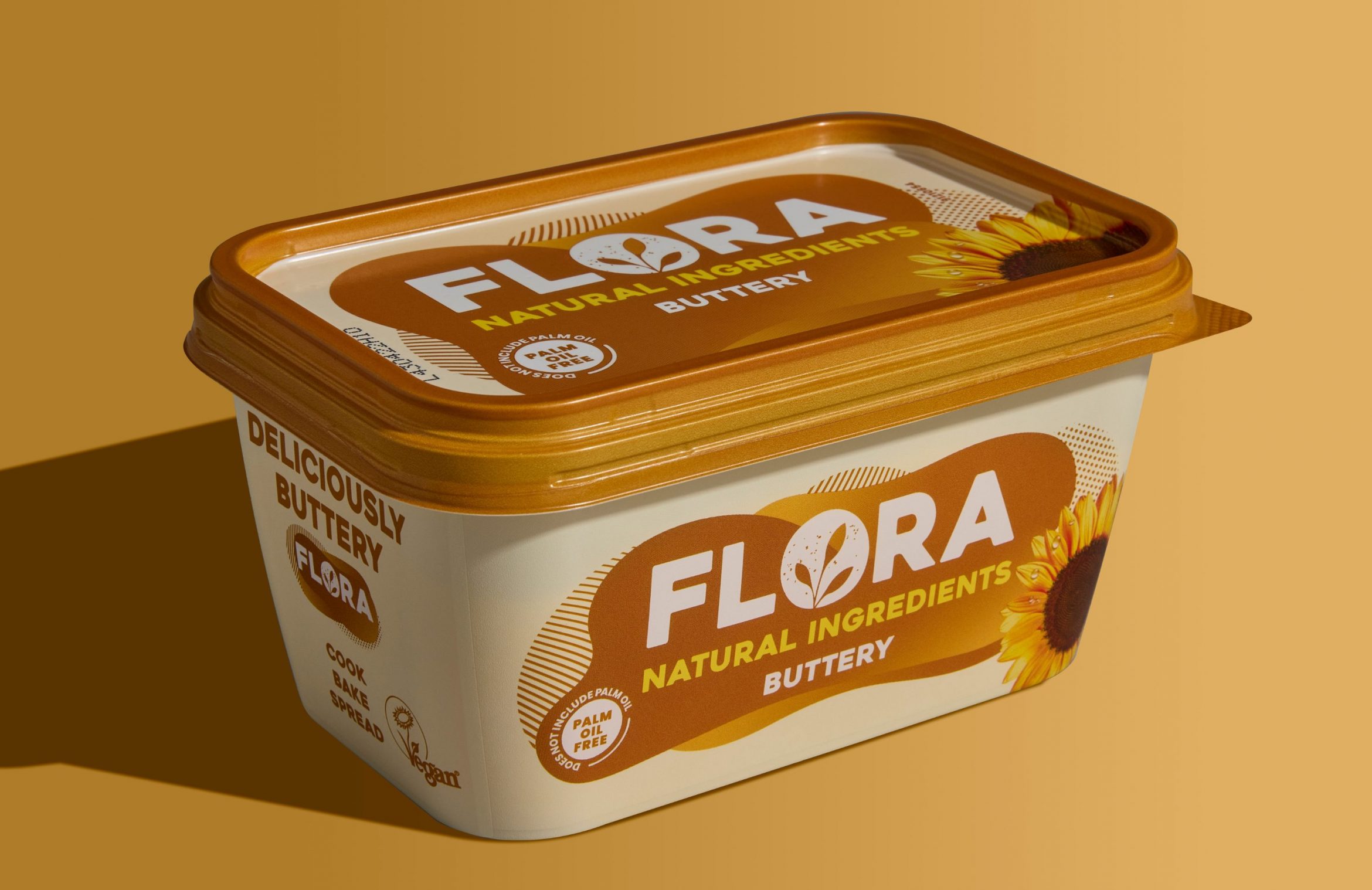
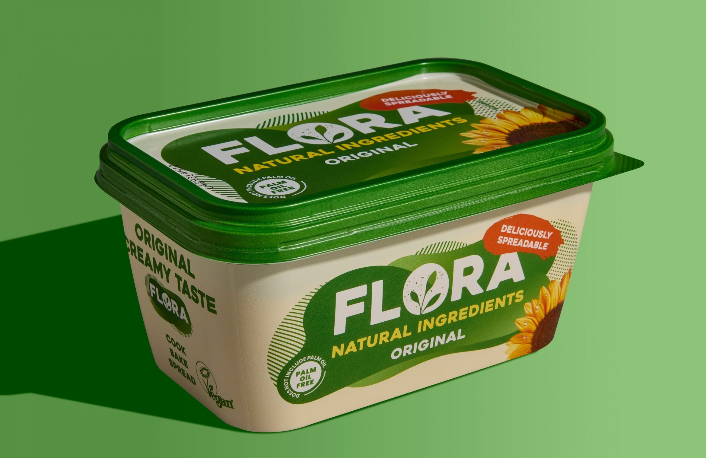
Flora’s brand refresh set out to reinforce its position as a rich and creamy alternative to dairy – one that delivers superior performance in cooking, baking, and spreading without compromise. The new identity needed to reflect this positioning with a modern, standout design that would differentiate Flora on the shelf while maintaining familiarity for existing consumers.
Our challenge was to adapt and roll out this bold new look across multiple global markets, each with its own portfolio, product range, and regulatory requirements. From spreads to creams and blocks, the new identity had to be applied consistently across various pack formats, print methods, and languages – while ensuring the brand’s premium quality and taste credentials were visually reinforced.