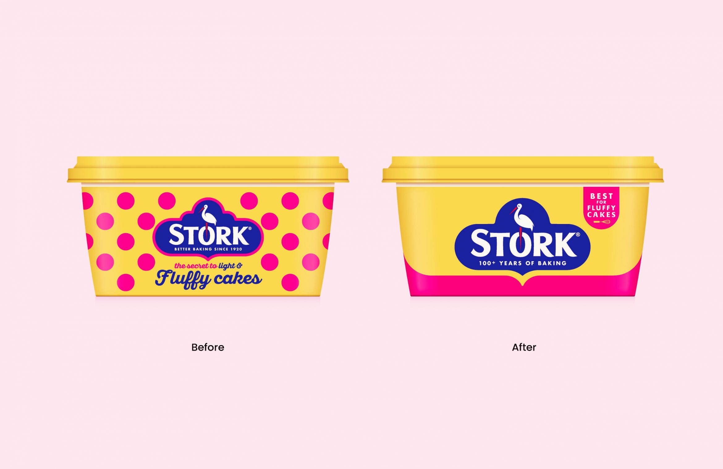
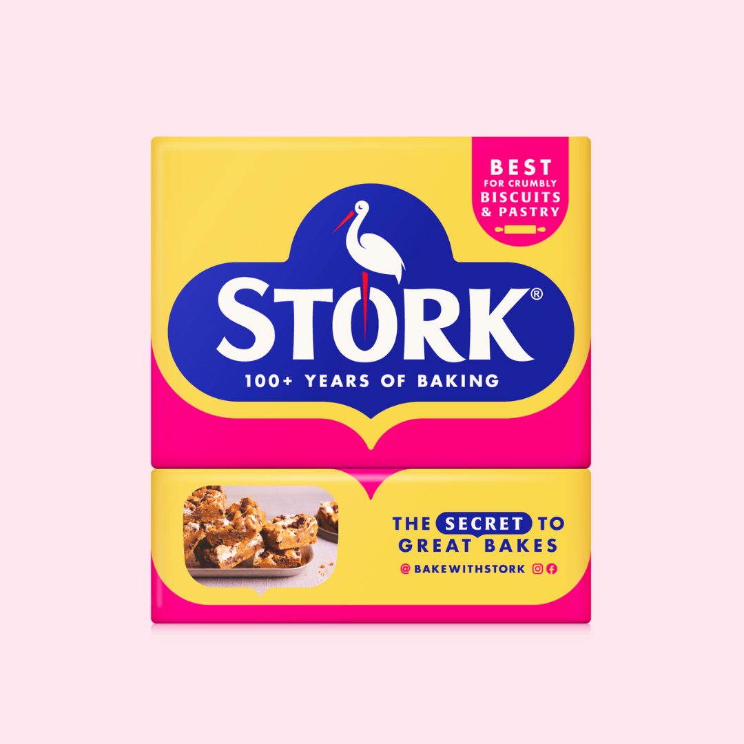
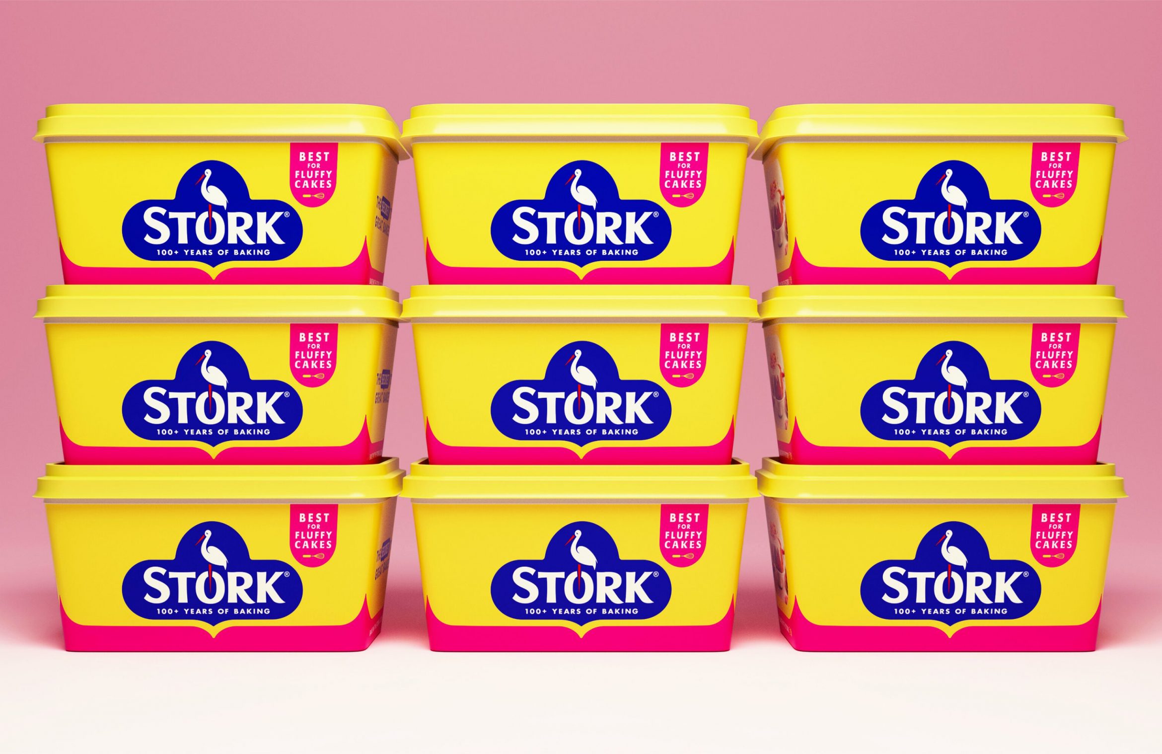
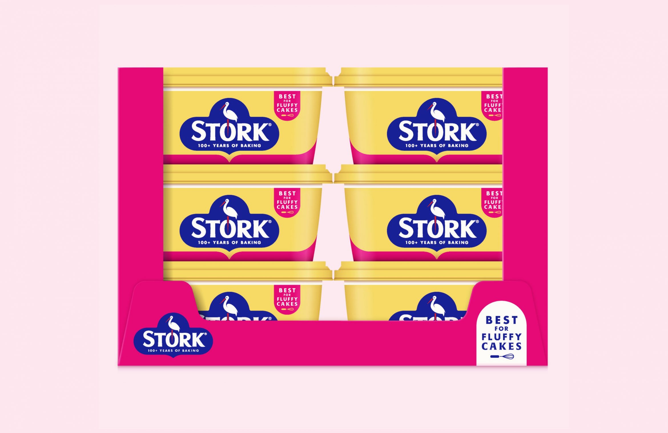
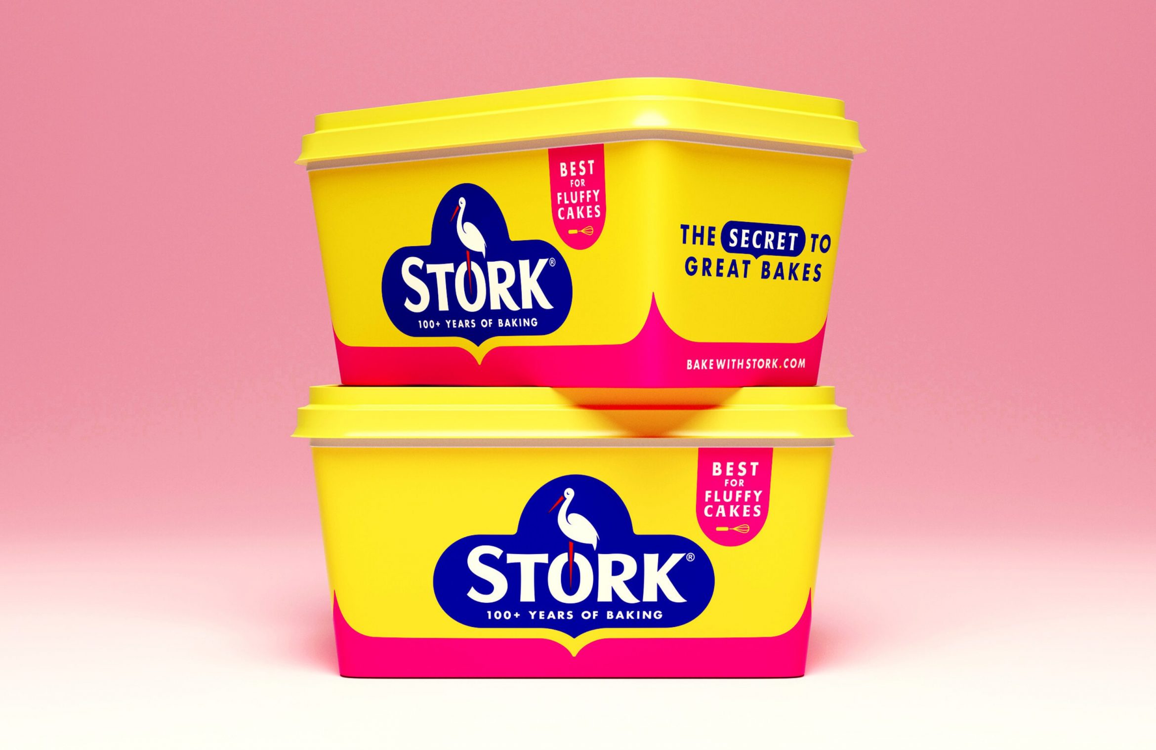
Open/Close Burger Menu

Boosting baking heritage with a design refresh for Stork

Honouring a legacy and connecting with next-gen bakers
Boosting baking heritage with a design refresh for Stork image
CLIENT:
Upfield, Stork

TEAMS:
Creative
Graphics
Technology

Challenge

Stork, a cherished home baking brand since 1920, was looking to enhance and refresh its heritage appeal. The design challenge was to honour Stork’s visual legacy, connect with a new generation of home-bakers and be reassuringly recognisable to loyal consumers.

In a competitive baking category where private label is prominent, authentic heritage brands like Stork must convey confidence and a compelling reason to believe at the point of purchase.

What we did

Si Inman, our Creative Director explains that we brought much-needed love to the brand by refining the iconic Stork logo, promoting it to centre stage and giving it the space it deserves. During our exploration of heritage messages, the phrase “100+ years of baking” emerged as the most compelling to consumers. While the polka dots of the original design can bring to mind a sense of nostalgia and playfulness, they also ran the risk of seeming outdated or childish in today’s modern design codes. As brand-blocking has become prevalent in the spreads aisle, with private label imitating the yellow and pink palette, we strategically developed a distinct and clean design, utilising Stork’s rich heritage colours to achieve maximum impact and standout.

“Stork has long been recognised as a people’s brand, and we committed to evolve the brand while honouring its deep-rooted history, notably The Stork Cookery Service of the 1940s. This community initiative provided advice to households on how to provide meals despite rationing restrictions,” revealed Ross Gray, Senior Designer at Sun Branding.

Our creative team developed a simple and confident visual language, including the pink-line-device, which evolved from the idea of “baking memories”, the shape inspired by a timeline of memorable moments created through generations of baking with Stork. We combined heritage, with the Stork bakers of today, featuring real bakes made by star ‘Stork-ers’ on the side of packs, helping to connect with Stork’s growing insta community #bakewithstork.

Results

Collaboration and trust between client and creatives helped to achieve fantastic results. The Stork team kept the brief relatively open, to allow the designers creative freedom to solve the challenge. The initial concepts challenged the Stork team in the right way, and the chosen route was developed further to absolutely nail the brief.

The new refreshed design is instantly recognisable as Stork because it elevates the unique assets that make Stork so distinctive. I love how the tub and block play together, the range is more connected and considered, even down to the SRP tray, which the Sun team pro-actively added to the brief, ensuring greater appeal in store. It’s new and modern in the right way, and we think long-term Stork-ers will agree. 

Julie Dang
Junior Brand Manager
Stork

The Sun team were collaborative and a pleasure to work with. Their way of working made our lives so much easier and the refreshed Stork packaging speaks boldly for itself.

Julie Dang
Junior Brand Manager
Stork

Previous