Open/Close Burger Menu

Creative Jury verdict on Lyle's Syrup rebrand

Creative debate around the heritage brand refresh
READ TIME:
4 mins

TEAM:
Creative

PUBLISHED:
February 2024

As part of our ‘Nostalgia’ series, the top topic sparking debate in the creative studio is the reworked Tate & Lyle’s Golden Syrup packaging. To rebrand or not to rebrand??

We asked our Sun Creative Jury to gather on the bench and deliberate.

Not sure any of us realised, until recently, that the original packaging featured a dead lion swarmed by bees or the religious story behind the image. So we asked our eclectic mix of creative jurors, who are a mix of Gen Zs to Gen Xs and everyone in between, for their views. Have a read of what they have to say…

Senior Designer – Laura Taylor

Creative Jury verdict on Lyle’s Syrup rebrand image

I personally quite like the re-design. It manages to retain key elements of its heritage whilst appealing to new consumers. Interestingly, I never really noticed the depiction of the dead lion and swarm of bees before; in my mind, it always had a livelier, sketched lion illustration. The removal of religious symbolism seems appropriate in today’s diverse cultures, where many are less influenced by religion.

By incorporating a more positive illustration, the brand takes a step forward in inclusivity.

Retaining the original design on the tin, for me personally strikes a great balance, ensuring customer retention and appealing to a broader audience.

Designer – Jason Philip

Creative Jury verdict on Lyle’s Syrup rebrand image

I appreciate the more contemporary execution that retains most of the recognisable brand assets. However, it does feel a shame to lose an essence of its heritage to modernity. I am happy to hear that the classic tins are excluded from the rebrand, preserving their world record and authenticity on one of their packaging formats.

Overall, I understand the fight for relevance and the attempt to appeal to a modern consumer. It will be intriguing to observe how these changes resonate and perform in the market.

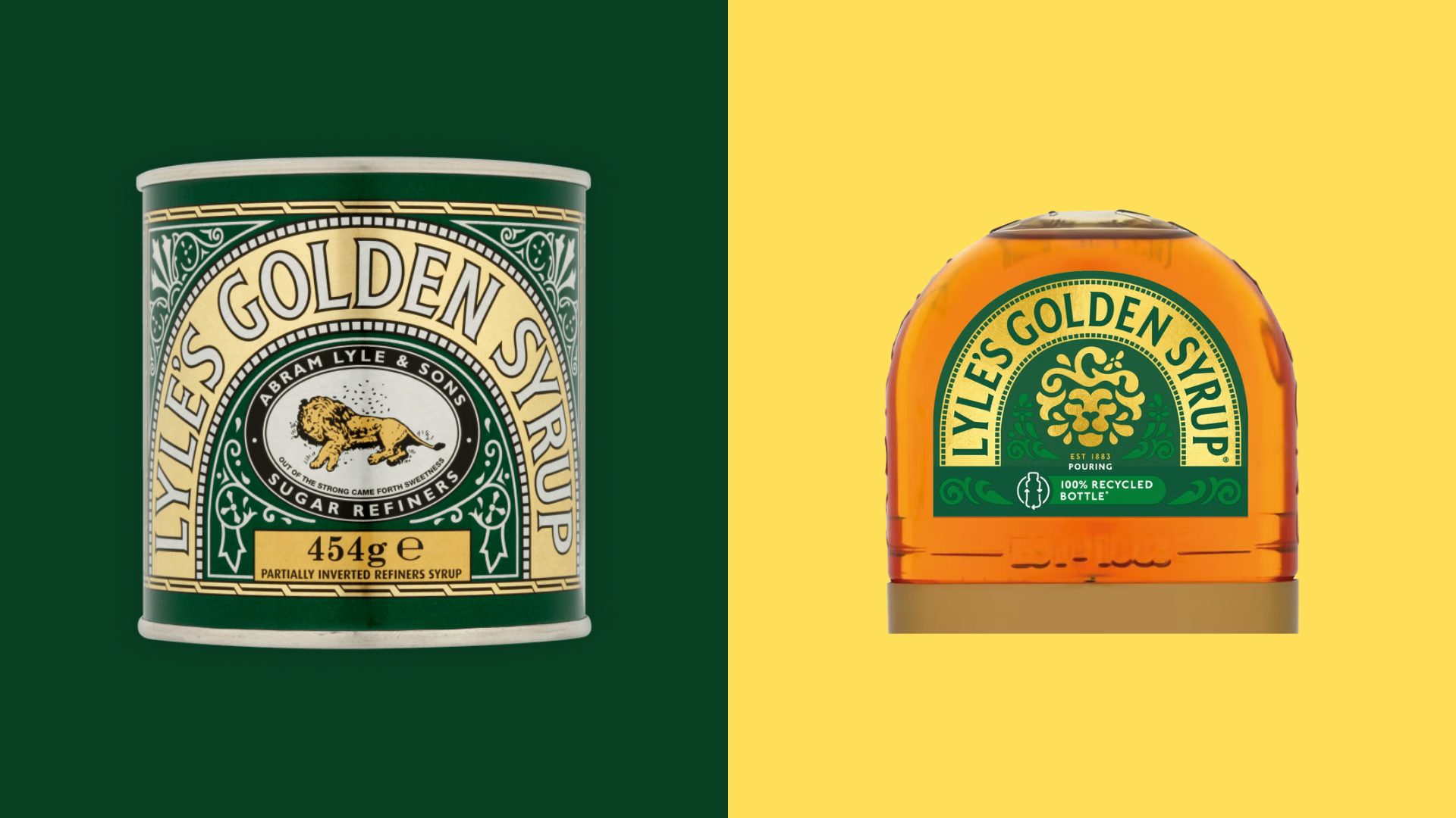
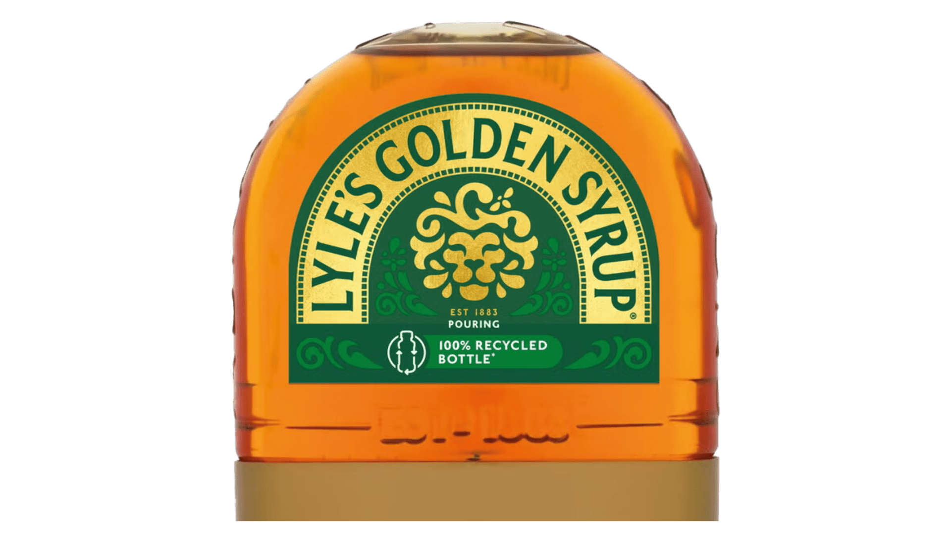
Taking a closer look at the new illustration, I admire how the lion shares a relationship with the product through its softness, and I like the subtle heart-shaped nose. Perhaps it serves as a symbol of compassion and a nod to their generational presence in our lives.

Senior Designer – Ross Gray

Creative Jury verdict on Lyle’s Syrup rebrand image

Although the redesign is lovely, I don’t think it was necessary.

The Lion had a story which is now lost. I don’t believe that changing the lion will be a hang up to anyone wanting to buy golden syrup. The brand held the Guinness world record of 140 years of never changing.

It’s lost a USP, and with it goes a little bit of trust.

Designer – Sophie Gregan

Creative Jury verdict on Lyle’s Syrup rebrand image

As a lover of vintage brands and retro-style packaging it saddens me to see so much heritage stripped away. The original had a nostalgic feel; it was delicately crafted, reminding me of old hand-painted signage. Though modern audiences will appreciate a brand’s history, they also want easier navigation, through clean, bold designs and playful marketing.

The new design is clean and impactful; the lion’s head more approachable, creating a sense of joy and warmth, that perfectly embodies the feeling of baking at home. The flourishes are retained, making them bolder to fit the new style.

However, it has lost its sense of tradition through texture, the old design resembled that of a screen print, and I’m not a fan of the faux foil look. It’s definitely turning heads and making people notice the brand. Redesigns are never going to please everyone, but at least the iconic tin will retain the cherished design!

Being an Elder Gen Z’er, I recognise the need for brands to shake things up and cater to younger audiences. Consumers in their early twenties and younger won’t share the connection to the original design that older generations do. Lyle’s are proactively trying to attract their future audience.

Design Director – Caroline Kaye

Creative Jury verdict on Lyle’s Syrup rebrand image

At first glance, I thought “oh no”, another brand ready to lose all its heritage overnight. This will be a bumpy ride!

Or maybe not… the more I look at the craft of the lion and the simplicity of the overall design, it feels more modern and fresh. The rework of the lion head has a friendlier look than its usual current ‘dead’ pose, new lion makes me smile.

For me, the tin is the star of the show, iconic of its time, thank the lord Tate & Lyle recognise this. It seems the tin is staying put.

Tate & Lyle have been brave on this one, the appeal to a younger audience with its recycled packaging will go down a treat. Well, it has us all talking, so job done!

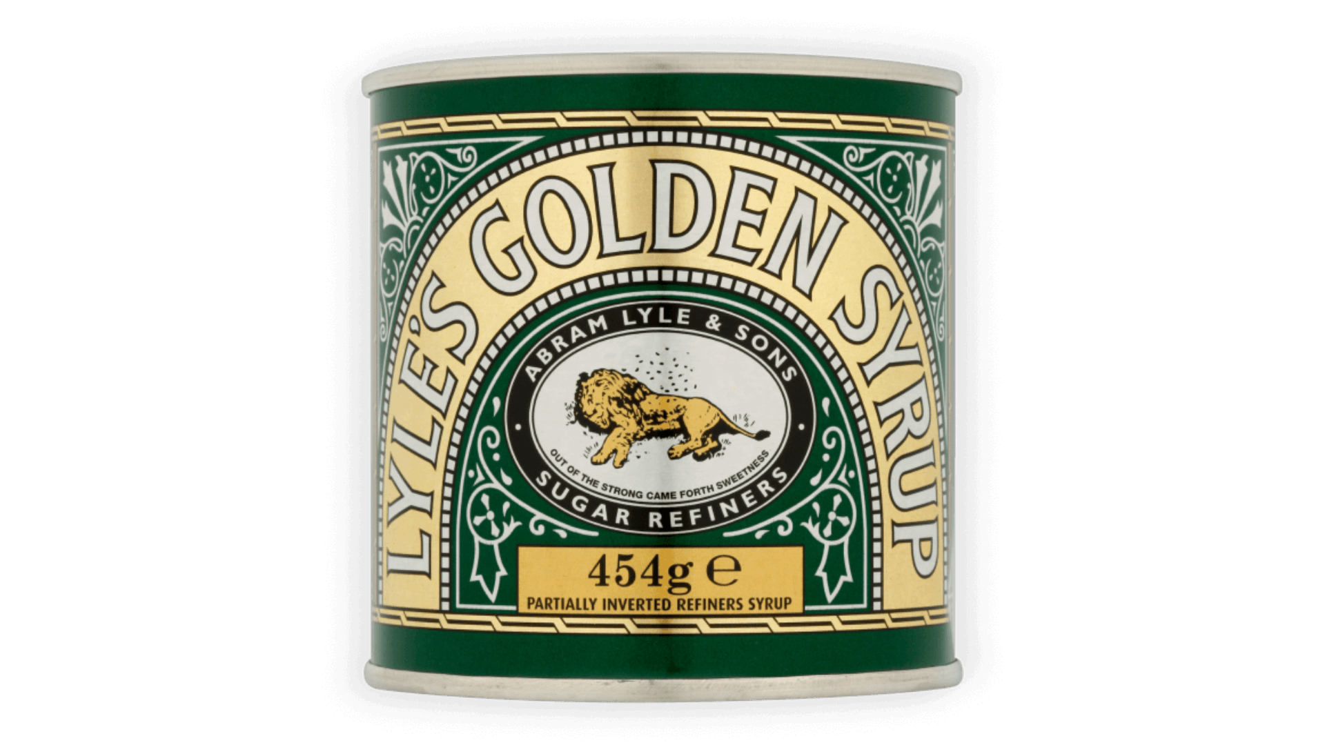
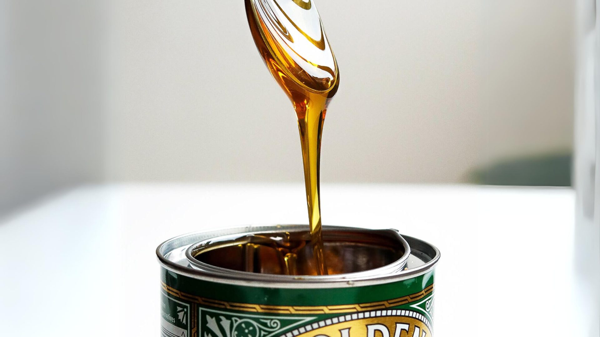
This brand makes me feel nostalgic, remembering a time when I used to sneak into my great Aunt Hilda’s store cupboard, dunking an overflowing dessert size spoon of this lovely golden goo. I can re-imagine the sweet taste and feelings of naughtiness, and would jump at a bellow from the front room, “What are you doing in there?”

Senior Designer – Matt Fish

Creative Jury verdict on Lyle’s Syrup rebrand image

I don’t mind the rebrand, I think it’s retained a complementary feel to the heritage and modernises it in a subtle way, keeping the essence of the brand. If you look closely, the story is still there with the bees flying around the lion.

The old design is incredibly iconic so it’s always going to be a controversial decision to rebrand. It’s like a classic VW camper compared to the new modern version – there’s always lovers and haters!

The verdict

This time our Creative Jury didn’t reach a unanimous verdict; however, they were generally in favour of the refresh and agree that this will appeal to younger consumers. With relief all-round that the beloved tin remains intact with all of the original brand assets.


If you’d like to refresh your brand to reach a new audience, yet retain your original brand heritage (and existing consumers), we can help. Our creative team do this day-in, day-out.

Get in touch
Find out how our teams can help your brand grow